Interview Design Exercises
A slightly unconventional project page to showcase but I wanted to present some interview exercises. These were part of the interview processes for various designer roles. I often received a quick brief, sometimes a brand guideline, and a short deadline to get these completed. They were definitely a fun challenge!
Project:
Campaign
Illustration
Social Media
Emory University
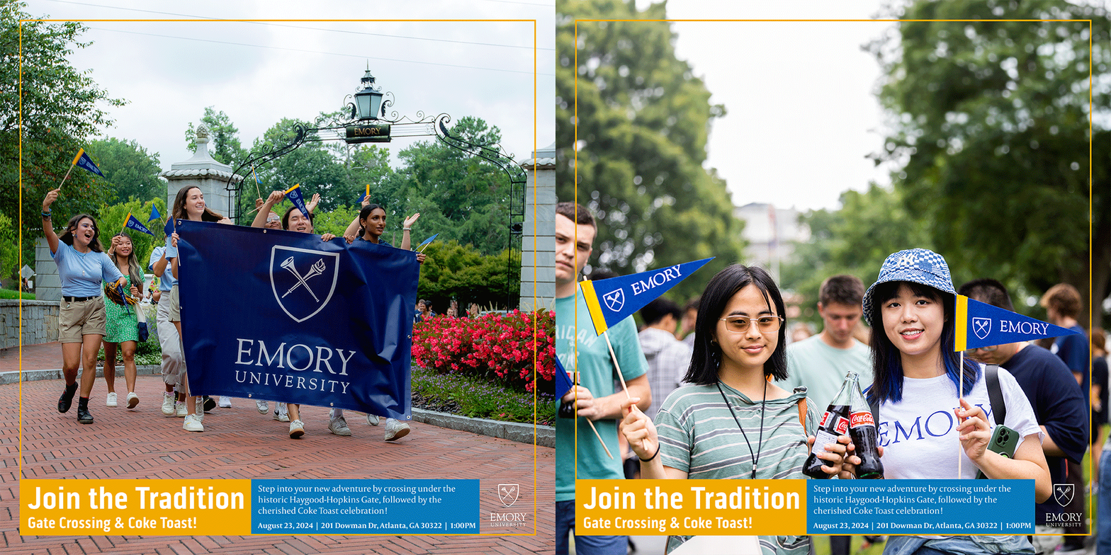
For this Graphic Designer Exercise, I was assigned to design a print graphic, digital graphic, and an additional element for The Emory Gate Crossing + Coke Toast campaign.
8.3 x 11.7 Print Piece
I picked this action shot from Emory’s photo gallery. It shows students enthusiastically holding an Emory banner as they cross under the Emory Gate. I also wrote a clear call-to-action to invite new students to join the tradition.
Digital Graphic
For the digital graphic I designed this gif that could be used for social media. It shows the image from the previous printed graphic in addition to two students toasting coke bottles. The copy is placed in the graphic but it would also be written in the caption. I also maintained brand consistency with the color and fonts.
Swag
For my third element in this campaign, I made 3 illustrations to be used as stickers. Each one expresses the main campaign, whether it’s community with the class of 2028, the Coke Toast, or the Haygood-Hopkins Gate, which the students walk under to start the tradition.
Knowing that my audience Gen-Z, I mocked up the stickers on an Owalla water bottle. That’s their favorite waterbottle after all,
Industry Nine
Industry Nine is a bicycle company based in Asheville, NC. They are known for making top of the line components. I was assigned to make a info sheet for a series of stems that went to market last year. I wanted to make sure the information came across clearly all the while showcasing some of the production at their factory.
Info Sheet
I started with the colorful eye-catching image of the stems as the hero. A lead-in with the industry nine blue brings us into the main copy. I organized the text on the left side to allow the production photos on the right to shine on their own. The stem options at the bottom are in the same order as the info about them in the paragraph. I added bullet points for clarity with the stem length options.
Landmark Properties
Landmark Properties is a property development company specializing in student apartment communities at top universities. I was tasked with creating a campaign for their Austin property, The Mark. Some of their merchandise featured fun illustrated characters, which influenced me to make my own. I decided to illustrate a welcoming sun, signaling to follow it along on its skateboard.


